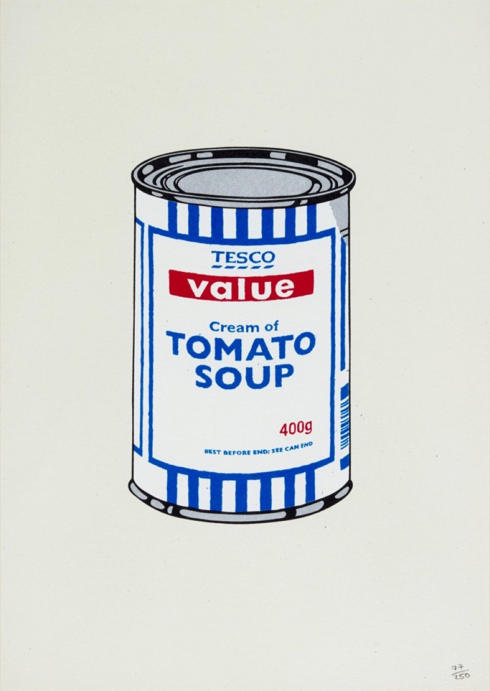
A Familiar Icon, Recast
Few works illustrate Banksy's sharp understanding of art history and consumer culture as effectively as Soup Can. By reinterpreting one of the most iconic images of 20th-century art through the lens of British mass retail, Banksy creates a work that is both homage and critique—bridging Pop Art and contemporary consumerism with precision. Where Warhol elevated everyday consumer goods into the realm of fine art, Banksy reverses the gesture: bringing the language of high art back into the reality of low-cost, mass-produced consumption. The result is a work that questions not only what we consume, but how we assign value.
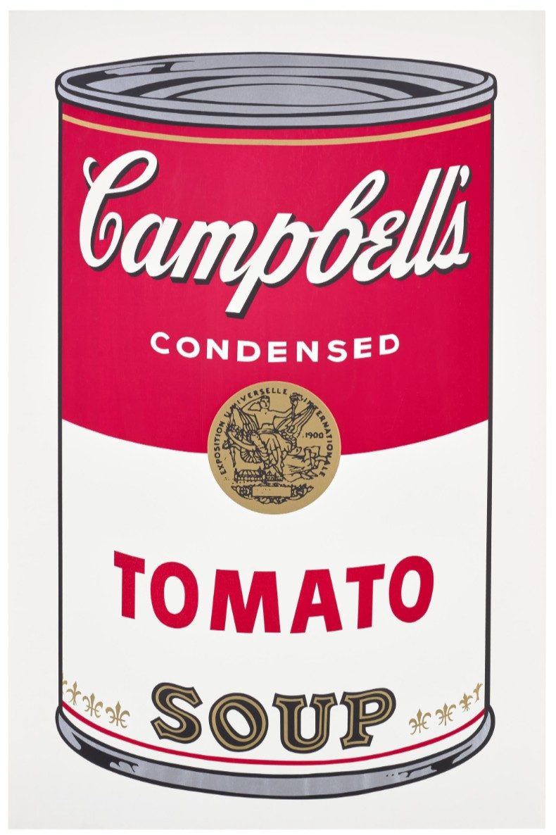
The composition immediately recalls Warhol's legendary Campbell's Soup Cans, with their clean lines, frontal presentation, and graphic simplicity. Yet upon closer inspection, the American brand has been replaced by a Tesco Value label: a symbol of budget consumption in the UK.
The shift is subtle but decisive. Warhol's original image, once associated with the rise of consumer culture and the democratization of art, is here recontextualized within a system defined by cost efficiency and standardization. The elegance of Pop Art gives way to the blunt reality of discount branding.
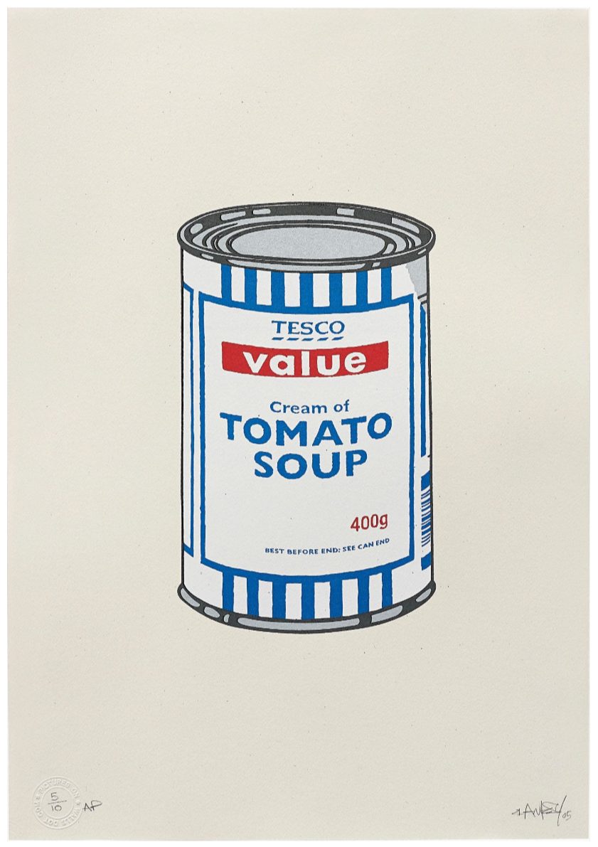
Banksy adopts a deliberately clean and controlled visual language, echoing the aesthetic precision of Pop Art while maintaining the immediacy of his own stencil-based approach. The composition is stripped down, almost clinical, reinforcing the industrial nature of the object it depicts. As a screenprint, the work maintains a strong graphic presence, allowing the image to function both as an artwork and as a visual statement on reproduction itself. This duality, between art object and consumer product, is central to the work's impact.
Value, Branding, and the Collapse of Distinction
Soup Can is a meditation on value: both economic and cultural. By replacing Warhol's already commercial subject with a budget alternative, Banksy pushes the logic of Pop Art to its limit. If Warhol blurred the boundary between art and consumer goods, Banksy suggests that the distinction may have disappeared entirely.
The Tesco Value branding introduces a new layer of meaning. It reflects a culture increasingly defined by price, efficiency, and accessibility: where identity is shaped not by aspiration, but by consumption at its most basic level.
Twenty-Eight Ways to Paint the Same Soup
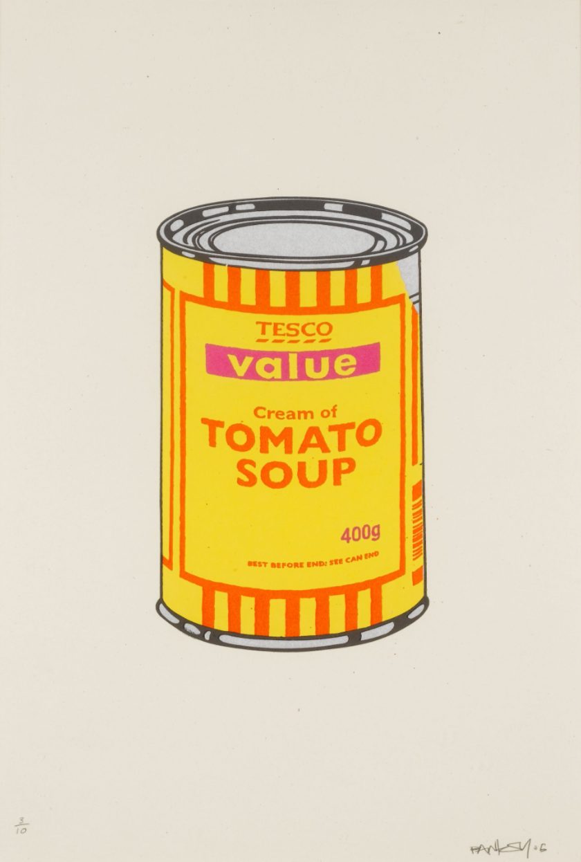
The 28 colorways transform Soup Can from a single joke about Tesco and Warhol into something considerably richer. Banksy keeps the image completely fixed while allowing color to become the variable. Banana, cherry, lime, emerald, mint, violet, lilac, orange, hot pink, sky blue, dark blue, tan and purple migrate across the same three principal areas of the design, producing radically different versions of an otherwise identical object. Pictures on Walls treated these combinations as distinct colorways, each issued as just ten signed impressions.
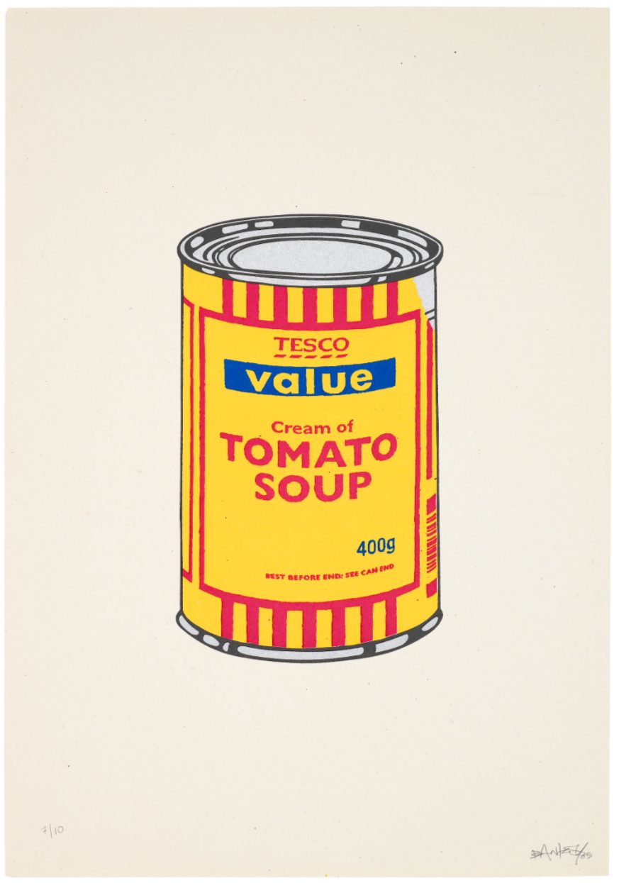
And the combinations are fabulous precisely because they are not timid. Banksy does not merely shift the Tesco blue slightly toward turquoise or replace red with another plausible packaging color. He liberates the can completely from the supermarket. Banana collides with purple; emerald sits against lilac; orange meets hot pink; mint appears beside cherry. Some combinations are harmonious, others deliberately acidic, and several border on the chromatic absurdity of psychedelic commercial packaging.
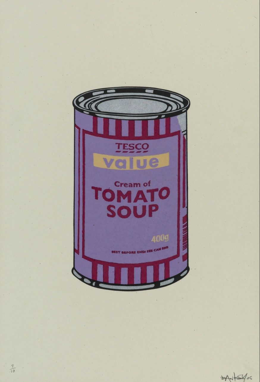
The result creates a fascinating reversal. The original blue, red and white version remains immediately identifiable as Tesco Value. Once those corporate colours disappear, however, the logo begins to lose its commercial authority. What remains is the architecture of the package—the oval, typography, bands and cylindrical form—treated almost as a template upon which color can perform.
This is where Banksy's conversation with Warhol becomes especially interesting. Warhol's original 1962 Campbell's Soup Cans famously presented 32 different varieties of soup, while maintaining the recognizable visual identity of Campbell's packaging. Banksy essentially reverses the equation: the product remains the same—Tesco Value Tomato Soup—but the colours change. Warhol gives us different contents in similar packaging. Banksy gives us identical contents in different packaging.
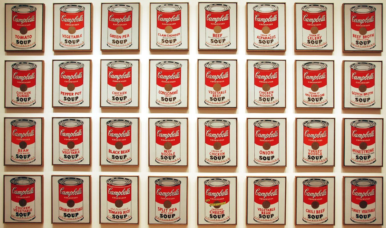
That distinction is wonderfully appropriate to the two artists. Warhol's supermarket is one of abundance: chicken noodle, tomato, clam chowder, vegetable and so forth. Banksy's Tesco Value shelf offers the same cheap tomato soup again and again—but dresses it in increasingly extravagant colours. There is almost an economic joke buried inside the chromatic beauty. Nothing inside the can has improved. Only the packaging has changed.
Soup Can Colorways
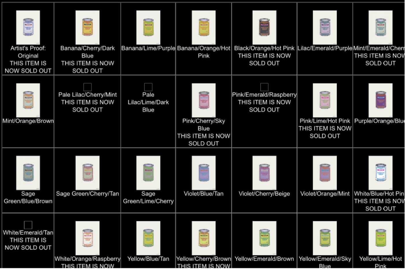
Twenty-eight colorways were produced, in editions of ten signed prints each. The Pictures on Walls release screen below listed them one by one, marking some of them as sold out. In fact the Original Colorway is the initial Colorway, with 10 signed APs, followed by 27 variations.
STAY INFORMED
Receive the latest news, exhibitions, artworks and market updates on Banksy.