
Rude Copper
Medium: Screenprint on wove paper
Year: 2002
Sheet: 59×42 cm (23 x 16 1/2 inches)
Printer & Publisher: Pictures on Walls, London
Editions
Numbering and Signature
Rude Copper is considered to be the first of Banksy’s commercial prints. Intended to be a run of 100 prints, it was changed to 250 at last minute. Some were hand-finished with unique spray painting, some others were tagged with the “Anarchy” sign, many extras were printed, and around 50 were signed. It was released on two different types of paper. Rude Copper was first sold and produced with Steve Lazarides, who was Banksy‘s agent at that time. Since he had no gallery space, he was selling the prints from the boot of his car. Release price was GBP 40.
Rude Copper (Anarchy Black)

Rude Copper (Anarchy Yellow)

“Some people become cops because they want to make the world a better place. Some people become vandals because they want to make the world a better-looking place.”
Authority Turned Against Itself
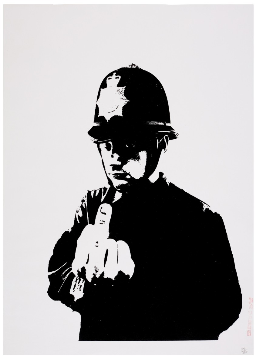
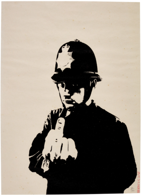
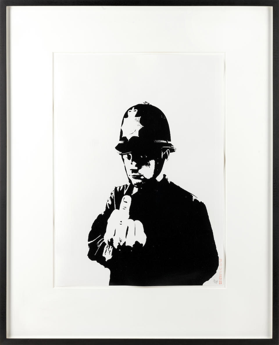
Few images in Banksy’s early oeuvre are as immediately confrontational as Rude Copper. By transforming a symbol of order into an agent of defiance, the artist creates a work that is both disarmingly simple and deeply subversive. Rude Copper stands as one of Banksy’s most iconic early works, encapsulating his direct challenge to authority and institutional power. Through a single, unmistakable gesture, the artist disrupts the image of law enforcement as a figure of control and respectability. The result is a work that operates with striking efficiency: clear in its message, yet layered in its implications.

Banksy, Existencilism, May 2002
The composition presents a British police officer in full uniform, rendered in profile. The figure is instantly recognizable: the traditional “bobby,” associated with discipline, neutrality, and public order. Yet the defining element lies in the gesture. The officer raises his hand, extending his middle finger toward the viewer. This act, universally understood as one of insult and defiance, directly contradicts the role the figure is meant to embody. The reversal is immediate and powerful. Authority is no longer imposing control; it is expressing contempt.
Executed using Banksy’s signature stencil technique, Rude Copper relies on clarity and immediacy. The figure is rendered with minimal detail, yet remains entirely legible, allowing the gesture to dominate the composition. The monochromatic palette reinforces the starkness of the image, stripping it down to its essential components. As a screenprint, the work maintains this directness, enabling wide circulation without losing impact.
Defiance, Distrust, and Institutional Critique
Rude Copper is a work about trust, and its breakdown. By depicting a figure of authority engaging in an act of open disrespect, Banksy exposes the fragile relationship between institutions and the public. The work does not rely on complexity. Its strength lies in its directness, forcing the viewer to confront a simple but unsettling question: what happens when those meant to uphold order embody its opposite? Rather than offering a nuanced critique, Banksy delivers a blunt visual statement: one that reflects broader tensions between authority, control, and individual freedom.
Rude Copper remains one of Banksy’s most recognizable and widely circulated images. Its clarity and immediacy have ensured its enduring relevance, both within the art world and in popular culture. More broadly, Rude Copper exemplifies the foundation of Banksy’s practice: the ability to challenge authority through minimal intervention, transforming a single gesture into a lasting statement.

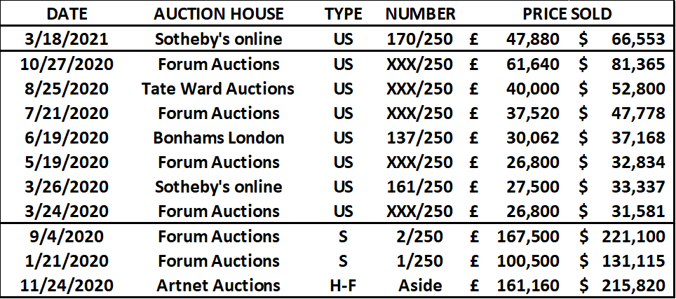
Auction Results
PLEASE CLICK BELOW FOR AUCTION RESULTS

